How To Make A Great 404 Page?
In the world of web design, a 404 page is an often overlooked but crucial element. This page appears when a user tries to access a page on your website that doesn’t exist. Whether due to a mistyped URL, a broken link, or a removed page, encountering a 404 error can be frustrating for users. However, a well-crafted 404 page can turn this potentially negative experience into a positive one, enhancing user engagement and reinforcing your brand identity. In this comprehensive guide, we’ll explore what makes a great 404 page and how you can create one that not only retains visitors but also adds value to your site.
Understanding the Purpose of a 404 Page
A 404 page serves several key functions:
- Informing the User: It tells users that the page they were looking for cannot be found.
- Offering Alternatives: It provides users with options to find what they were originally looking for or discover other parts of your site.
- Maintaining Engagement: It keeps users on your site, reducing the likelihood of them leaving out of frustration.
A great 404 page accomplishes these functions with clarity, creativity, and functionality.
Elements of a Great 404 Page
1. Clear and Concise Messaging
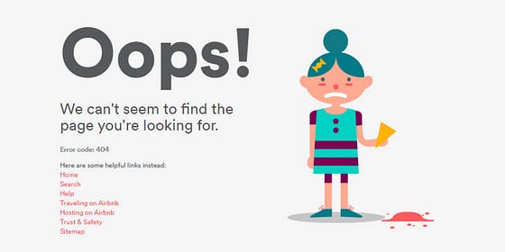
Your 404 page should immediately inform the user that the page they were looking for is unavailable. Avoid jargon and technical language. A simple message like “Oops! Page not found” or “We can’t seem to find the page you’re looking for” is effective. Make sure the message is friendly and approachable.
2. Consistent Branding
Your 404 page should reflect the look and feel of your website. Use the same color scheme, fonts, and logos. This consistency reassures users that they are still on your site and not lost in the digital wilderness. Incorporating elements of your brand voice can also help reinforce your brand identity.
3. Navigation Options
Provide users with options to navigate to other parts of your website. This can include:
- Homepage Link: A prominent link back to your homepage.
- Search Bar: Allow users to search for what they were trying to find.
- Suggested Links: Offer links to popular pages or categories on your site.
- Menu Navigation: Include your site’s main navigation menu to give users access to all major sections of your site.
SFWPExperts is a top-tier WordPress web development company specializing in custom website solutions. With a focus on innovative design and seamless functionality, SFWPExperts helps businesses enhance their online presence and achieve their digital goals with tailored WordPress solutions and exceptional client support.
4. Engaging Visuals
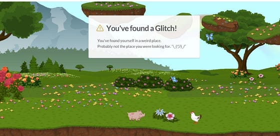
Visual elements can make your 404 page more engaging and memorable. This could be an illustration, an animation, or even a humorous image related to the error. Visuals should complement your brand and the message you are conveying.
5. Humor and Personality
Injecting humor into your 404 page can help diffuse frustration and leave a positive impression. Clever and light-hearted messages or graphics can turn a potentially negative experience into an enjoyable one. However, ensure that the humor aligns with your brand voice and doesn’t detract from usability.
6. Contact Information
Sometimes users might need additional help. Providing contact information or a link to your support page can be beneficial. This shows that you care about your users’ experience and are available to assist them.
7. Custom Error Codes
While the standard message is a 404 error, you can customize the error code message to include additional information or unique branding. For example, “Error 404: Page Not Found” can be followed by a more creative or detailed explanation.
8. Responsive Design
Ensure your 404 page is mobile-friendly. With a significant portion of web traffic coming from mobile devices, a responsive design ensures that all users, regardless of device, have a seamless experience.
9. Analytics Integration
Tracking how often users land on your 404 page and what they do next can provide valuable insights. Integrate analytics to monitor these behaviors and adjust your 404 page or fix broken links accordingly.
Examples of Great 404 Pages
1. GitHub

GitHub’s 404 page features a playful illustration of an octocat in a space suit floating in a zero-gravity environment. The message is clear and concise: “This is not the web page you are looking for.” Below the illustration, there are links to GitHub’s homepage, search bar, and support page.
2. Airbnb

Airbnb uses a clean design with a friendly message: “Oops! We can’t seem to find the page you’re looking for.” It includes a prominent search bar and links to popular destinations and pages. The page also features a humorous animated image that aligns with Airbnb’s playful brand identity.
3. Lego

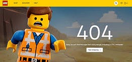
Lego’s 404 page showcases an image of a Lego minifigure in distress, conveying the message that the page is missing. The page is visually engaging, fitting well with Lego’s playful and creative brand. It offers links to popular sections of the website, ensuring users can quickly find their way back.
4. Slack

Slack’s 404 page is simple but effective. It features a minimalistic design with a clear message: “We couldn’t find the page you were looking for.” The page includes a search bar, links to Slack’s main features, and an option to contact support. The clean design aligns with Slack’s professional yet friendly brand image.
Creating Your Own 404 Page
Step 1: Plan Your Content
Start by deciding what content you want on your 404 page. This should include:
- Main Message: Clear and friendly text informing the user that the page is not found.
- Navigation Options: Links to your homepage, popular pages, or a search bar.
- Visual Elements: Images, animations, or graphics that align with your brand.
- Contact Information: A way for users to get in touch if they need help.
Step 2: Design the Page
Design your 404 page to be visually consistent with your overall site. Use your brand colors, fonts, and logos. Ensure the design is clean and uncluttered, focusing on helping users find their way back to relevant content.
Step 3: Add Functionality
Integrate functional elements like a search bar and navigation links. Ensure these elements are easy to use and prominently placed on the page. Adding a feedback form can also help you gather insights into why users ended up on the 404 page.
Read More: How To Make A Great 404 Page?
Read More Articles:
- SEO for WordPress: The Ultimate Guide for 2024
- Top AI Plugins for WordPress: Revolutionizing Your Website in 2024
- How to Make a WordPress Website in 2024 (Ultimate Guide)
- OpenAI’s GPT-3.5 vs GPT-4: A Comparative Analysis of Advanced AI Language Models
- Top 10 Free Website Builders: Elevating Your Online Presence Without Cost
- What is Social Media Marketing?
- Artificial Intelligence Integrating Web Development: Enhancing User Experience and Efficiency
- What is Competitor Keyword Analysis? Understanding, Tools, and Strategies
- Best Free WordPress Themes: Elevate Your Website Design Without Cost
- How To Fix Broken Backlinks In 2024
- SEO Tips: How To Analyze Competitors’ Sites For SEO
Visit Site: Web Design Company


Comments
Post a Comment